
How to Run a Ping and Traceroute Using PingPlotter
Estimated Reading Time: 6 MinutesThis guide will walk you through running a ping test and traceroute using PingPlotter 5 Free, a third-party application available on Windows, macOS, and iOS. If you’re using an Android device, you’ll need to run these tests on a desktop computer with Windows or macOS.
Disclaimer:
By using PingPlotter, you agree to participate in this diagnostic process. PingPlotter, highly recommended by most ISPs, helps identify the root cause of network issues like latency and packet loss. While we guide you through the process, SpinTel is not responsible for any changes to your network or devices. The data collected will be used exclusively for troubleshooting purposes.
If you prefer not to use this tool, please let us know, and we can offer alternative options.
Note: The Free version of PingPlotter is sufficient for these simple tests; no need to purchase the Standard or Professional versions.
1. Download and Install: Visit PingPlotter to download and install the application.
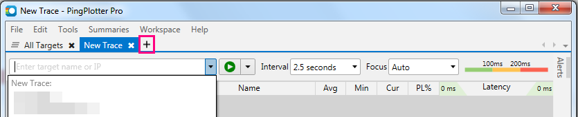
2. Launch Application: After installation, open PingPlotter. Click the (plus) icon at the top to start a new trace.
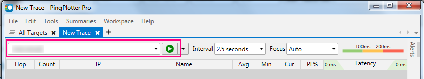
3. Enter Address: In the address bar, type in spintel.net.au or any address you want to test and click Start to begin the test.
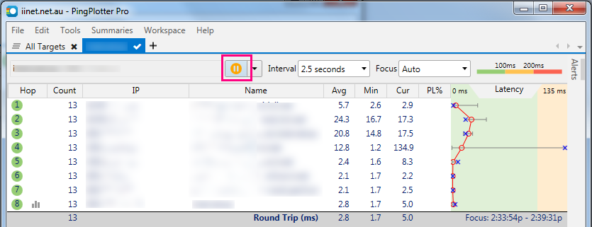
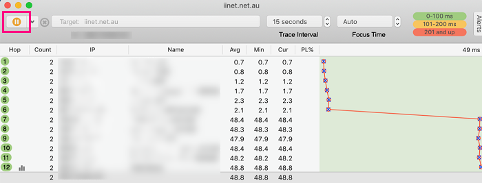
4. Run Test: Let the test run for at least a minute. Once the results stabilise, click Pause.
1. Download and Install: Visit PingPlotter to download and install the application.
2. Launch Application: After running through the installation, launch the application.
3. Enter Address: In the address bar, type in spintel.net.au or any address you want to test and click Start to begin the test.
4. Run Test: Let the test run for at least a minute. Once the results stabilise, click Pause.
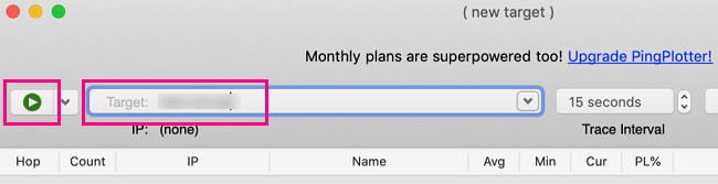
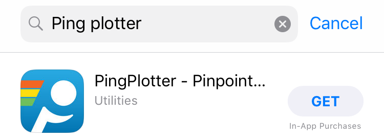
1. Download and Install: Open the App Store and search for "PingPlotter." Download and install the app.
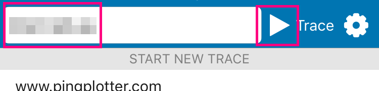
2. Enter Address: Once the app has been installed, open it and type in spintel.net.au or any address you wish to ping/traceroute into the address bar at the top of the screen, then hit the Start button to begin the test.
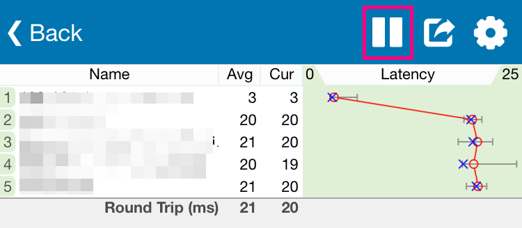
3. Run Test: Let the test run for at least a minute. Once the results stabilise, click Pause.
The Trace Graph shows the details of your current trace. The Trace Graph is made up of two parts, the Data Table and the Latency Graph.
The Trace Graph gives you a bird’s-eye view of your collected PingPlotter data. As the data is collected, you can begin looking at the Data Table and Latency Graph to find patterns of high latency and packet loss.
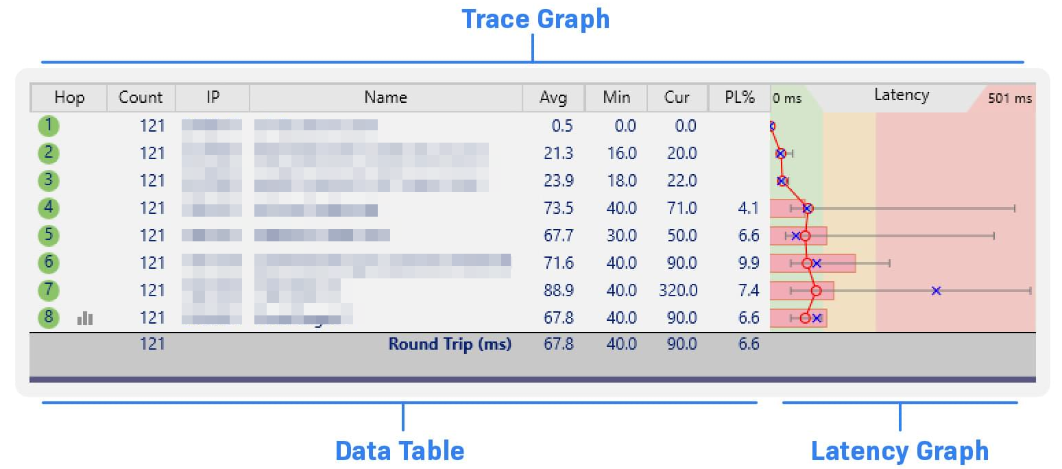
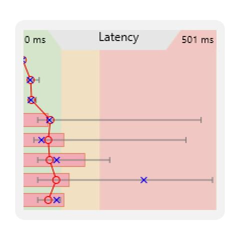
The table on the left is the Data Table, which shows the raw details of each hop between you and your target. The graph on the right is the Latency Graph, which gives you a visual representation of the trace data for easy parsing.
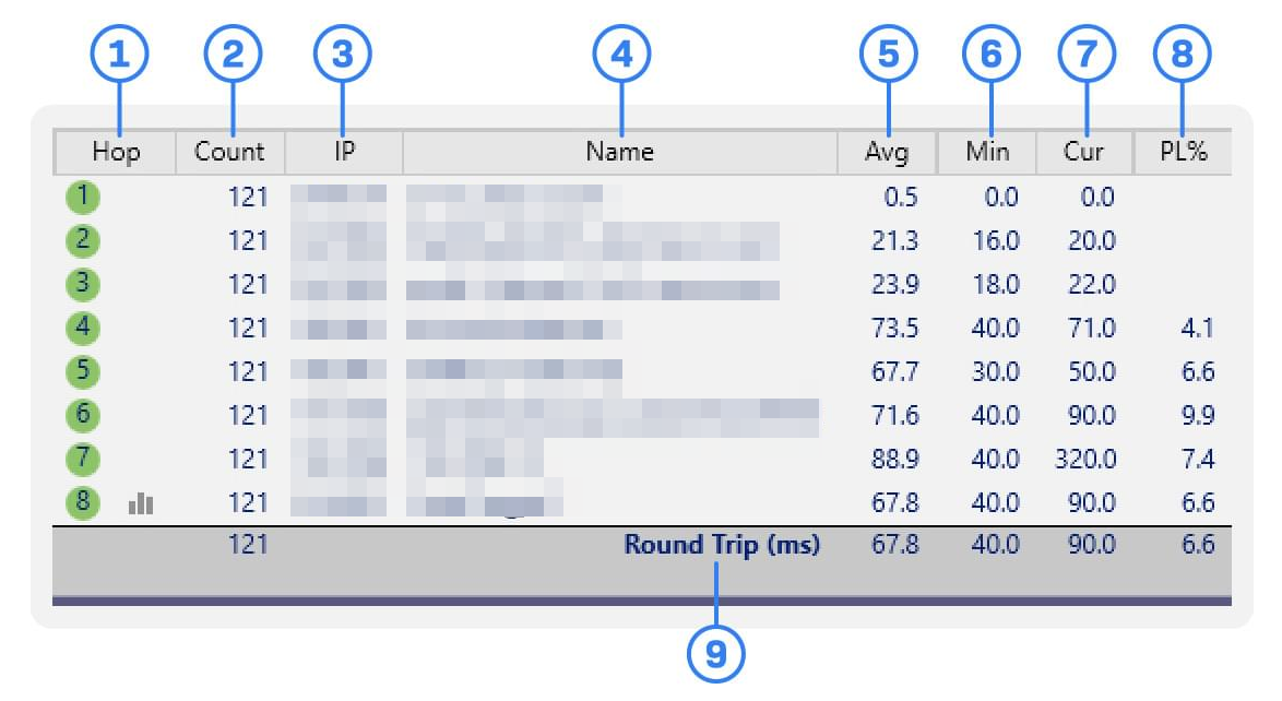
- Hop Number: This lists the order of hops between you and your target. A circle denotes an active hop and is color-coded to show latency based on the Graph Color Legend. A graph icon shows which hops have a Timeline Graph open (more on that later).
- Count: The number of packets sent during the current focus period.
- IP Address: The IP address of the device at the hop.
- DNS Name: The name of the device at the hop. If this is blank, it means the router/server/hamster wheel doesn’t have a DNS name or doesn’t like the packet type currently being used.
- Avg: The average ping response time for the current focus period. This average ignores timeouts and lost packets.
- Min: The fastest ping response time for your current focus period.
- Cur: The response time for the last packet sent. If you see “ERR,” the last packet sent was lost.
- Packet Loss %: The percent of lost packets over the current focus period.
- Round Trip: A simplified set of data for the target of your trace. This shows the total time it takes to send a packet from your device to the target and back.
 Average latency for the current focus period. This average ignores timeouts and lost packets.
 The range of latencies recorded for a specific hop during the current focus period.
 A color-coded representation of latency, as defined by the Graph Color Legend in the Target Bar.
 The response time for the last packet sent.
 A cool connect-the-dots to help you visually track hop latency.
 The percent of lost packets over the current focus period.
On the Latency Graph, the average latency of each hop is shown as a red circle. The range of latency values for each hop in your current focus period is shown as a horizontal gray bar. If the high end of your latency range is dipping into the red, you should give the offending hops a closer look.
The percentage of lost packets over the current focus period is indicated by a horizontal red bar. When you see a red bar, it means, at some point during testing, PingPlotter was unable to reach that hop. If PingPlotter’s packets couldn’t make it, there’s a good chance your other ones couldn’t, either. It’s often a good idea to inspect hops with packet loss.
The Timeline Graph is a visual representation of your collected trace data. It helps you see the fluctuations in network performance over time.
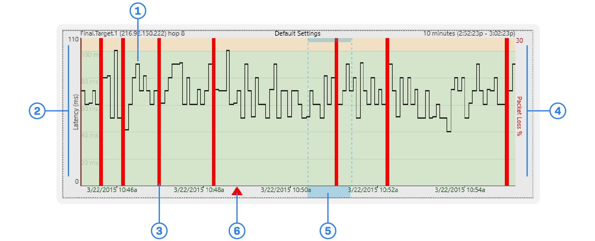
- Latency: The ping round-trip time to the selected hop.
- Latency Scale: A reference to aid in evaluating hop latency.
- Lost Packet: An indicator showing a packet sent in that trace interval went MIA.
- Packet Loss Scale: The percentage of packets lost within the displayed timeline segment.
- Focus Area: The section of collected data currently being displayed in the Trace Graph.
- Comment Indicator: An indicator showing a comment made at a specific point in time on the Timeline Graph.
Reading the Timeline Graph
By default, the Timeline Graph shows the performance of your final hop (the trace target) over the last 10 minutes. You can open additional Timeline Graphs for a hop by double-clicking on the corresponding hop in the Trace Graph. You can change the time frame graphed by right-clicking on the Timeline Graph. You can also scroll the Timeline Graph with the mouse scroll wheel or by clicking and dragging on the graph.
Graph
Latency is represented by the black line snaking through the graph. If the black line is spiking into the red, you’re experiencing high latency. Packet loss is displayed by a vertical red line on the graph. If you see a grouping of red lines, it’s worth inspecting.
To capture evidence of an issue in PingPlotter, you can save and share your collected data in various ways:
- Sample Set File (.pp2): Export your session data for review by selecting "Export Sample Set" from the file menu.
- Screenshot: Save an image of your current target window graph via "Save Image..." in the file menu.
- Text File: Export trace data to a text file by selecting "Export to Text File..." in the file menu.
- Share Online: Create a unique webpage with PingPlotter’s "Share" option, hosting both a screenshot and up to 24 hours of trace data for easy sharing.
After capturing your data, you can use it to diagnose the issue or share it with us for further assistance. Simply click the chat icon below or visit our website, and one of our representatives will help you with the problem.